Posts

Showing posts from February, 2018

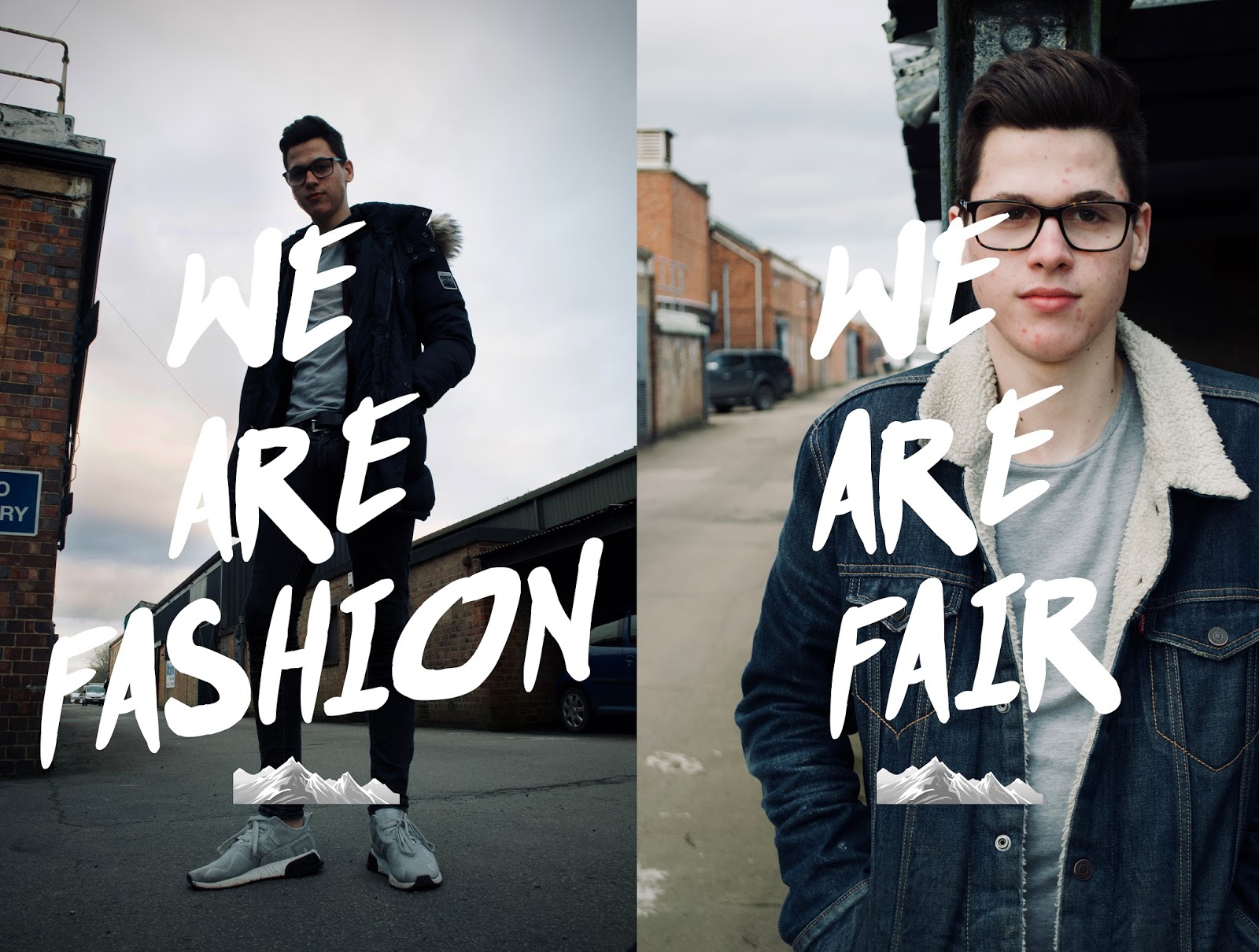
Textual Analysis - H&M 'Bring It On'

Image
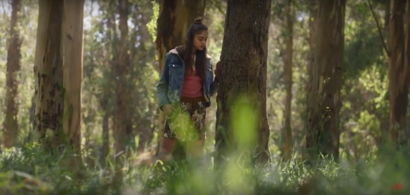
Camera The overall focus throughout the video is on the clothes and their fabrics, whether they are being worn or recycled. The camerawork uses a number of varied methods to help the audience focus on the clothes throughout. By using long shots to show a full outfit or a close us to emphasise the fabric or it tearing. The focus on the clothes tearing and being mangled can give off a rough feel; H&M manages to emphasise this through their use of a hand held camera. This constant unsteadiness allows for a less neat feel, which is what the ad tries to convey at the start with the damaging of clothes.  Sound  The ad consists of a number of diegetic and non-diegetic pieces of sound. The non diegetic sound features a soundtrack and a voiceover in the form of a narrative. The soundtrack is piece of music that builds in intensity throughout the ad by adding layers to the music until a climax. This allows the video to have an intense and empowering feel throughout, it represe

Evaluation - Arctic Apparel Posters

Image
Overall, I believe the final posters followed the statement of intent well. I managed to keep a blue tint across the posters, which allows them to be related to the logo colour. However the sky on the day of the shoot was more overcast than I would’ve liked, which makes it difficult to see the W and A in ‘we’ and ‘are’ on the first poster. I managed to darken the sky without it looking too obvious so that the letters were more visible. The colours go together well and I managed to keep any other features such as the no entry sign and cars suited to the blue, orange and grey colour palette. I feel the clothes are suited to their environment and the fabrics are emphasised well. However the denim jacket in the second could be centred more so it is in full view for the audience. I feel the text conveys our selling points well and suits the feel of our brand. I was unsure about the colour of our logo, It would make sense to use our traditional blue, so the it can be related to the overall

Final Posters

Image

Final Images

Image

Statement of Intent - Arctic Apparel

Image
Arctic Apparel is a high end winter clothing brand. The clothes range from parka coats to overcoats to casual jackets and other winter accessories The Brief  My company “Arctic apparel” will manage to create a marketing campaign that will emphasise our Fair-trade ideologies and our winter fashion selling points.  The Posters My products will be shown through two different posters that share similar features of mise-en-scene, so they can be related to ‘Arctic Apparel’. The posters will be shown in different locations, however with a similar background; This background being an industrial park. I plan on shooting in colour and maintaining a blue tint across the posters. This allows the posters to relate to our light blue logo. All the features in the poster will contribute to this overall blue look, from the sky to the clothes to cars In the background and street signs. Other features in the background such as the orange brickwork will compliment this blue and give an aestheti

Contact Sheet - Arctic Apparel

Image
Green Boxes are the approved images.