Fashion Advertising
H&M Advertising
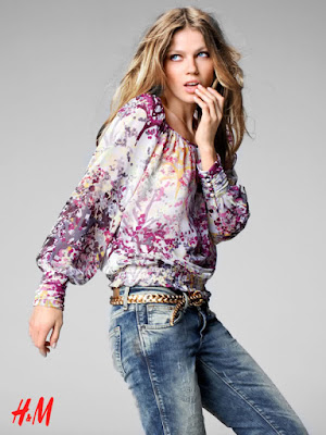
H&M’s advertising is much more minimalistic than most fashion brands out there. They rarely shoot in a real world location, instead they keep to a single coloured set. Using a set like this allows more focus to be put on the clothes and the model, which is ultimately the key selling point. H&M will usually position their model in the centre of the image to draw all attention towards the model and reduce any distraction from the set.
The shot below is an exception for a typical block coloured set H&M would use, in this they use a sheet material instead; however the way that the sheet creases are angled towards the model still draws attention to the her. Also because of the look of the clothes, the sheets can emphasise this flowing and loose look of the top. These features still put all focus onto the clothes in the typical H&M advertising style.
H&M models are usually positioned in stylistic ways, different to usual stances in other advertisements. by positioning them in these unique ways, more attention can be drawn to them and therefore the clothes as they stand out.
H&M almost always place their logo on a corner of the image to allow more attention to be drawn to the clothes but still letting the audience know where to buy it, which is an obvious requirement. the price of the clothing seen is sometimes shown next to the model, this is done to emphasise H&M’s cheap prices to their customers to get them interested. They don’t use any phrases such as ‘Only £….’ like other cheap clothing retailers, instead they just show the price and a simple label for the clothes. This simplicity doesn’t confuse the audience with materials and other unnecessary information about the clothes that this target audience doesn’t need. Their audience will see this and know this is what they are looking for, especially if they are looking for something as simple as a ‘pull’, as seen above. Also, when looking at the price, an audience will know that this genuinely cheap due to H&M’s lack of emphasis through the text.This is because H&M know that there clothes are cheap and they don’t need to force the message out.
H&M occasionally use two images on one advertisement, usually of the same model with the same clothes. This can allow for more than one angle of the clothes to be seen. For example, the images above show two images of the same model and clothes. The first image shows a close up of the model and allows for a closer look at the top’s fabrics. the second simply shows how the top can go with an entire outfit.
This effect can create a more casual atmosphere for the audience. By introducing the advertisement with a close up of the model the audience wont feel like the whole advert is about the clothes and they aren’t just being sold to. By showing just an image of the model, the audience will be drawn in as they need to know what the image is for/advertising.
Overall, H&M are much more subtle in how they advertising. They stick to clean colours and don’t spend much on location shoots. Almost all their focus is on the clothes and the price, which are the main selling points as well ad showing the brand which they do with their logo. Every feature from positioning to the text is used to draw focus to the model and therefore the clothes.


Comments
Post a Comment