Posts

Fashion Advertising

Image
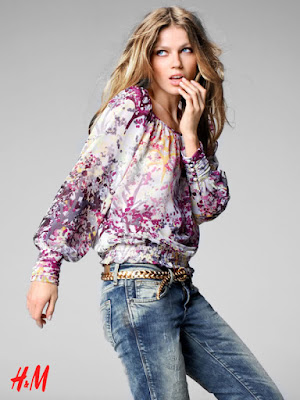
H&M Advertising H&M’s advertising is much more minimalistic than most fashion brands out there. They rarely shoot in a real world location, instead they keep to a single coloured set. Using a set like this allows more focus to be put on the clothes and the model, which is ultimately the key selling point. H&M will usually position their model in the centre of the image to draw all attention towards the model and reduce any distraction from the set. The shot below is an exception for a typical block coloured set H&M would use, in this they use a sheet material instead; however the way that the sheet creases are angled towards the model still draws attention to the her. Also because of the look of the clothes, the sheets can emphasise this flowing and loose look of the top. These features still put all focus onto the clothes in the typical H&M advertising style. H&M models are usually positioned in stylistic ways, different to usual stances in o...
Fairtrade marketing research

Image
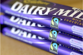
Fairtrade have partnered with a number of products to help their marketing campaigns and sell their own products. Their products range from bananas and chocolate to beauty products and gold, plus many more. As well as selling their own products they distribute their logo onto other existing products and shops that contribute to their cause. Such as Cadbury’s, Waitrose, Ben and Jerry’s, Boots, AMT coffee and many more. When it comes to advertising, lots of products use Fairtrade similarly to advertise their product. Cadbury’s for example uses the Fairtrade logo on their chocolate bars; this is the simplest piece of marketing that they use. Cadbury launched an advertisement in 2012 that explained how they support Fairtrade. It explained how buying Cadbury’s dairy milk would support the Fairtrade cause and how it works exactly; they used this concept similarly to advertise their Cadburys drinking chocolate. Karma cola co. Karma cola co. is a fizzy dr...

Ownership Models Questions

1. What examples of ownership models, e.g. The Guardian’s trust ownership and The Daily Mail’s proprietor model could show the opportunities offered by the latter model for control by ‘press barons’. Ownership models like the Daily mail’s proprietor model offer a prime example of how media can be controlled to influence public political views. Press barons like Rupert Murdoch, who controls most UK tabloids, can be seen to share his political opinions in each of his newspapers; this allows for an unfair opinion to be shared with the UK. 

Intertextual Analysis - The Big Issue

Image
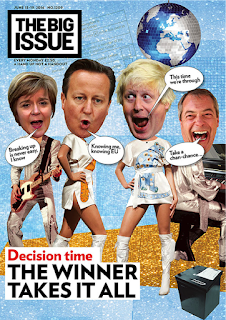
When first looking at the cover, what stands out the most is the use of humour to portray the 4 key politicians involved with the discussed topic of the issue: Brexit.   The clear intertextual link seen across the cover is with the Swedish pop group, Abba. Both the images and the text clearly relate to the band; using this link creates a humiliating and foolish portrayal of these political leaders, as the cheesiness of the band shown around them is not their typical environment. The bodies that the politicians have been placed on are members of the band, an obvious intertextual link; the bands unique style isn’t a typical outfit to be seen on these members, emphasising the humour/humiliation around the politicians. The texts, represented as speech bubbles from the politician’s mouths, are lyrics from well-known Abba songs, knowing me, knowing you and take a chance on me. They are ironic to these politicians’ beliefs around the topic; this emphasises the link to the...

Paradise papers Story coverage

Paradise papers Story coverage Daily Mail and The Guardian. When looking at how the guardian and the daily mail represent the same story, the obvious differences arise around the fact that the daily mail is a right wing tabloid newspaper and the guardian is a left wing broadsheet. Below is a list of all the conventions seen in each newspaper The Guardian: Media language: ·       Uses a Large amount of copy as it is a broadsheet and informative newspaper ·       The layout is clean and clear as it a much more expensive paper and doesn’t need to make room for splash story headlines and ads ·       The use of yellow compliments the guardians traditional blue, creating an eye catching effect for readers. ·       The use of a logo for the paradise papers can emphasise the importance of the topic and can make it easily recognisable for when they comment on the stor...